Discover Webflow’s latest 2025 Product Navigation updates — 5 UI improvements that streamline your workflow. See what’s new and how it impacts designers.

If you build with Webflow, you’ll want to pay attention to the latest update: Webflow has rolled out five key changes to its in-product navigation that aim to improve consistency, streamline workflows, and reduce friction. Webflow
I also made a video covering all five changes and how they affect everyday usage — you can watch it here:
Below is a breakdown of the changes, what they mean in practice, and tips on getting the most from the new nav.
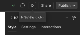
Webflow moved the Preview button back into the “site actions” section of the navigation — right where you’d expect it when you want to preview your work before publishing.
This restores a familiar pattern for many users and reduces the time spent hunting for preview mode. Webflow
Tip: After the update, remember: preview is now with your site actions again. If you don’t see it immediately, reload or refresh — sometimes the switch can lag visually.
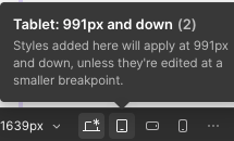
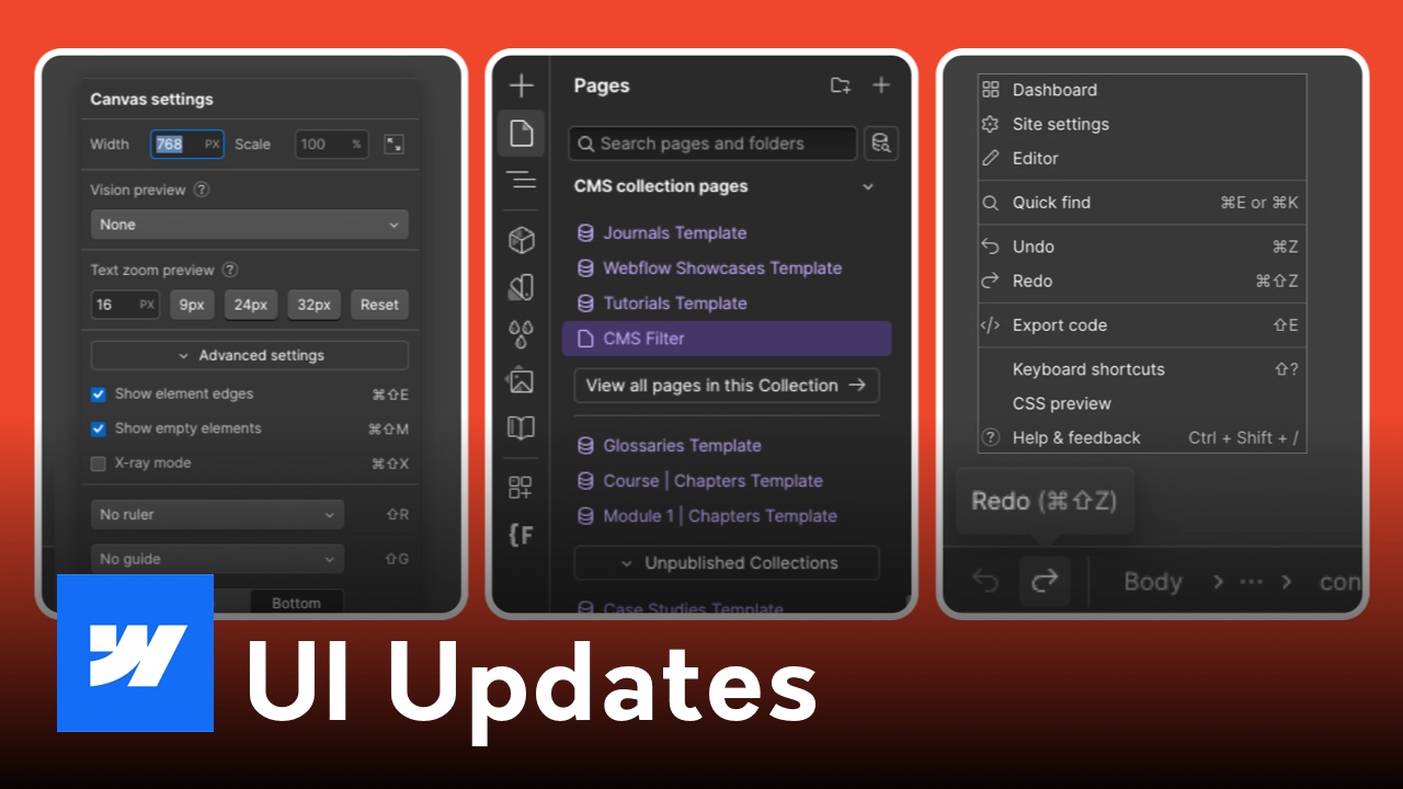
The interface for breakpoints and breadcrumbs has been cleaned up. You can now switch between responsive views (desktop, tablet, mobile) more fluidly, and the breadcrumb trail is easier to read and use. Webflow
Why it matters: quicker orientation in nested layouts and fewer clicks to jump between device views.
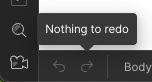
By popular demand, Webflow reinstated the Undo and Redo buttons in the UI. You no longer have to rely solely on keyboard shortcuts (⌘/Ctrl + Z and ⇧ + ⌘/Ctrl + Z). Webflow
Pro tip: These buttons are great when you're demoing or teaching Webflow to non-power users who may not know keyboard shortcuts.

The canvas bar (where breadcrumbs and breakpoints live) is now pinned to the top of the canvas by default. This gives quicker, more consistent access to those controls. If you prefer the old layout, you can still pin it back to the bottom. Webflow
Best use case: This top pin helps avoid UI elements being obscured as you scroll deeper into your design — especially useful in full-width or tall layouts.
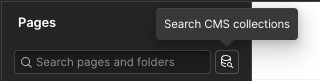
The context bar’s page search tool got smarter:
Why it helps: When your project has many pages or a mix of static + dynamic content, searching and jumping directly to the correct page is much faster.
Webflow’s navigation tweaks show they’re still listening to user feedback and making incremental improvements — not huge overhauls, but smart adjustments. If you already use Webflow daily, these changes will feel natural in no time.
If you want, I can also write a short “before vs after” guide or update that aligns with your video — want me to do that for your blog too?

