


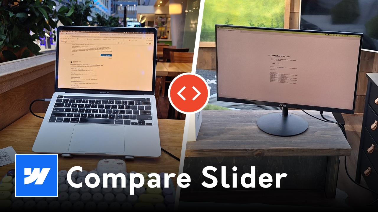
Learn how to create a high-performance before and after image slider in Webflow using the Beer Slider plugin. A step-by-step tutorial covering structure, custom code, and attributes.
<link rel="stylesheet" href="https://unpkg.com/beerslider/dist/BeerSlider.css">
<script src="https://unpkg.com/beerslider/dist/BeerSlider.js"></script>
<script>
$(document).ready(function() {
// This turns the standard JS library into a jQuery plugin
$.fn.BeerSlider = function( options ) {
options = options || {};
return this.each( function () {
new BeerSlider( this, options );
});
};
// This automatically finds all your sliders and starts them
$( ".beer-slider" ).each( function( index, el ) {
$( el ).BeerSlider( {start: $( el ).data( "start" ) || 50 } );
});
});
</script>
A before and after slider is an essential UI component for industries that rely on visual transformation. From real estate staging and photo editing to web design redesigns, this interactive element allows users to take control of the comparison. In this tutorial, we will bypass complex interactions and use a lightweight, robust method called Beer Slider to ensure smooth performance across all devices.
The success of a slider depends on a precise CSS box model setup. We need to ensure that the images are perfectly stacked and that the "reveal" layer is masked correctly.
Start by adding a Div Block to your page. This will act as the parent container for the entire component.
beer-sliderposition: relative and overflow: hidden.Insert an Image element inside the beer-slider div. This image serves as the background layer.
beer-imgAdd a second Div Block inside the BE-Slider wrapper, placed after the first image.
beer-revealPlace your second Image element inside the be-reveal div.
beer-image (same as above)Because this functionality relies on a specific script to track mouse and touch coordinates, we need to add a small snippet of JavaScript to the project.
Navigate to your Page Settings and scroll down to the Before tag section. Paste the Beer Slider library script here (code found above). If you plan on using this slider on multiple pages (like a portfolio template), it is more efficient to place this code in your Global Site Settings.
For developers who need granular control over multiple sliders on a single page, the Beer Slider plugin supports Custom Data Attributes. This allows you to bypass global code settings for individual instances.
By default, the slider handle usually sits at the 50% mark. To change this:
Beer Slider div block.data-start and the Value to your preferred percentage (e.g., 30 for a 30% reveal).This is particularly useful if the most impactful part of your "After" image is located toward the edge of the frame.
Beer Slider container has enough vertical margin. This prevents mobile users from accidentally swiping the slider when they are trying to scroll down the page.{
"@context": "https://schema.org",
"@type": "TechArticle",
"headline": "How to Build a Custom Before and After Slider in Webflow",
"description": "A technical walkthrough for building a responsive image comparison slider in Webflow using the BE-Slider library and custom data attributes.",
"image": "https://i.ytimg.com/vi/8zJA6NR1NbY/maxresdefault.jpg",
"author": {
"@type": "Person",
"name": "Derek Siu",
"url": "https://www.dereksiu.com.au"
},
"publisher": {
"@type": "Organization",
"name": "Derek Siu Design"
},
"mainEntityOfPage": {
"@type": "WebPage",
"@id": "https://www.dereksiu.com.au/tutorials/webflow-before-after-slider"
},
"video": {
"@type": "VideoObject",
"name": "Build Your First Before and After Slider in Webflow",
"thumbnailUrl": "https://i.ytimg.com/vi/8zJA6NR1NbY/maxresdefault.jpg",
"uploadDate": "2026-03-26",
"contentUrl": "https://www.youtube.com/watch?v=8zJA6NR1NbY"
}
}