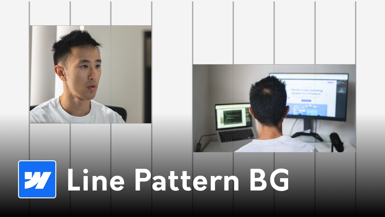
Subtle Line Pattern Background for Webflow
The line pattern background is a series of thin, evenly spaced vertical lines that sit behind your content. When tuned correctly, it adds gentle depth, guides the eye, and enhances perceived quality without competing with headlines or images. This article focuses on the design principles and best practices behind the effect so you can use it confidently across your Webflow projects.
What is a line pattern background?
A decorative backdrop made from uniform vertical strokes, typically 1px thick and repeated at consistent intervals. It functions as micro-texture: noticeable on second glance, supportive rather than dominant, and aligned with your layout grid.
Why designers use subtle vertical lines
- Establish rhythm that echoes your column grid and gutters
- Add depth without heavy imagery or complex textures
- Improve scannability on portfolio, case study, and product pages
- Convey a premium, crafted aesthetic with minimal visual noise
When this pattern works best
- Hero sections and simple content blocks that need polish
- Portfolios, case studies, and editorial layouts framing imagery
- Product and dashboard surfaces where grid rhythm aids comprehension
- Landing pages with generous negative space
When to avoid or dial back
- Small, text-heavy mobile views where texture can reduce legibility
- Sections already using photography or strong patterns
- High-motion areas; dense lines can shimmer during animation
Visual parameters that look premium
Thickness
Keep strokes hairline-thin. On modern displays, 1px is sufficient. Achieve perceived weight via color and opacity, not thicker lines.
Spacing
Choose gaps that match your layout rhythm. Common choices:
- 24–32px for general UI balance
- 32–48px for an airy, luxury feel
- 12–16px for technical or data-dense pages (test to avoid moiré)
Opacity and contrast
Aim for very low contrast so the pattern reads as texture:
- Effective opacity around 4–8% relative to the base surface
- Ensure body text still meets WCAG contrast when measured against the base color
Color in light and dark modes
- Light mode: neutral gray slightly darker than the background (e.g., rgba(0,0,0,0.06))
- Dark mode: neutral gray slightly lighter than the background (e.g., rgba(255,255,255,0.06))
- Brand tint: keep saturation subtle so UI states and media aren’t skewed
Alignment and rhythm
Align verticals to the grid or container width so the effect feels intentional. Avoid lines slicing through important UI controls or faces in photography.
Implementation options in Webflow (high level)
Native layers with divs
Create a fixed or absolute wrapper behind content and distribute thin divs for lines using Flex or Grid. Manage z-index and set pointer-events to none if needed.
CSS repeating-linear-gradient
Lightweight and scalable for any screen size. Great for theming with CSS variables and avoids extra assets.
SVG pattern tile
A tiny inline SVG repeated as a background image offers razor-sharp lines and flexible patterns (dashes, angles) with minimal file weight.
Performance and accessibility
- Keep the pattern static for near-zero cost to scrolling and paint
- Avoid parallax/fixed attachments on mobile to prevent jank
- Ensure interactive elements remain clickable by keeping the layer non-interactive
- Treat the lines as decorative; validate text contrast against the base surface
Responsive and dark-mode tuning
- Increase spacing 25–50% on small screens to reduce visual density
- Slightly lower opacity in dark mode to prevent glow on OLED screens
- Consider CSS variables for line color, gap, and thickness so themes are easy to tune
Common mistakes to avoid
- Over-density that reads as stripes rather than texture
- Thick strokes that compete with typography and imagery
- Misalignment with the grid, causing visual tension
- Placing lines beneath small, low-contrast text
- Animating lines without testing for shimmer or moiré
Quick starter values
- Thickness: 1px
- Gap: 24–32px desktop, 32–40px mobile
- Opacity: 4–6% effective
- Color: neutral gray matched to the surface in each theme
Use cases and keyword ideas
- Webflow hero backgrounds with subtle texture
- Minimal portfolio layouts with vertical line rhythm
- Case study pages emphasizing structure and hierarchy
- SaaS/product dashboards using soft, grid-like backdrops
Have Any Further Questions?
I'm Always Down To Help.
Contact Me
How did you find this tutorial?
Stay updated with my Newsletter!


