


Learn how to build Masonry Layout (Pinterest) in Webflow with clear step-by-step instructions, perfect for freelancers, designers, and Webflow beginners lo
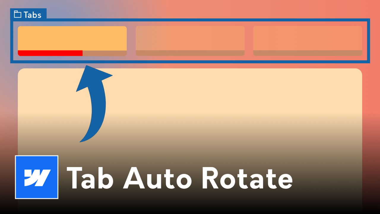
Before we dive into the practical aspects, let's briefly understand what Masonry Layouts entail. Unlike traditional grid layouts where each row has uniform heights, Masonry Layouts dynamically adjust the height of each item based on the content within it. This results in a visually pleasing arrangement where items fit snugly together like a puzzle, creating a seamless flow that captures attention. In this guide we will be scrapping using Grid and instead be using "Block" layout with "Columns" (found in the advanced typography settings).
To embark on our journey of creating a Masonry Layout, you'll need access to Webflow's intuitive web design platform. If you haven't already, sign up for an account and familiarize yourself with the basic features. Once you're ready, let's proceed to the exciting part - crafting your own Pinterest-style grid!
Begin by creating a new project in Webflow or opening an existing one. Choose a suitable layout for your page or create a new one to serve as the canvas for your Masonry Layout. Keep in mind the overall theme and purpose of your website as you proceed.
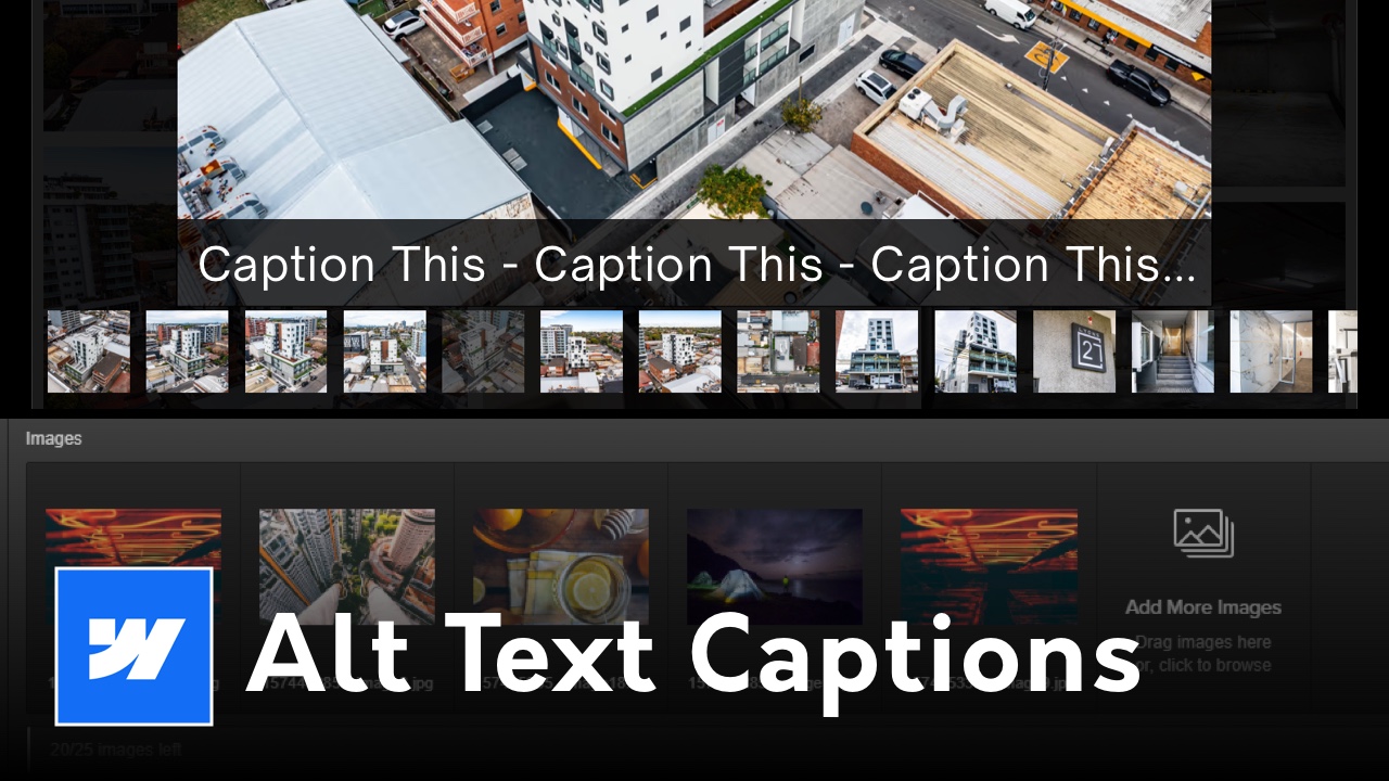
Collections are a powerful feature in Webflow that allow you to organize and display dynamic content. Create a new Collection or use an existing one to populate your Masonry Layout. Each item in your Collection will represent a card or tile in your grid.
Now comes the creative part - designing the individual cards that will populate your Masonry Layout. Experiment with different card sizes, shapes, and styles to achieve the aesthetic you desire. Remember to keep consistency in mind to maintain a cohesive look across your layout.
Once your cards are designed, it's time to integrate them into your Masonry Layout. Add a Collection List element to your page and bind it to the Collection you created earlier. Customize the layout settings to ensure your cards are displayed in a dynamic, Masonry-style grid.
Test your layout across various screen sizes to ensure responsiveness. Make any necessary adjustments to spacing, sizing, or layout settings to optimize the appearance of your Masonry Layout on different devices.
To further enhance user engagement, consider adding interactive elements such as hover effects or animations to your cards. These subtle touches can elevate the overall experience and make your Masonry Layout truly memorable.
Congratulations, you've successfully created a Pinterest-style Masonry Layout in Webflow! By mastering this design technique, you've unlocked a powerful tool for crafting visually stunning websites that capture attention and leave a lasting impression on your audience. Experiment with different layouts, styles, and content to unleash your creativity and take your web design skills to new heights. Happy designing!
