




User / Level Icon
Intermediate
Gear Time Icon
Webflow
Time Icon
7
 Minutes

How to Create Custom Organic Image Shapes in Webflow (CSS Border-Radius Tutorial)

Want to break free from boxy layouts? Learn how to create custom organic image shapes natively in Webflow using clean, client-friendly CSS border-radius.

Copy Code

How to Create Custom Organic Image Shapes in Webflow

In modern web design, everything is fundamentally built inside a square box. But if you want a website layout that breaks free from sterile grid structures and stands out, breaking the "box model" with fluid, asymmetrical, organic shapes is a game changer.

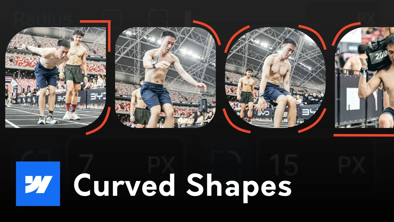
Using organic or non-standard shapes softens your brand aesthetic, giving it a friendly, natural, and custom feel. The best part? You don't need to create custom masked images in programs like Canva or Figma, which breaks your client’s ability to change images later. You can do this natively in Webflow using CSS.

In this tutorial, we will look at how to break down basic organic shapes using native Webflow controls and add beautiful interactive hover states to them.

The Problem with the "Design Program" Workflow

Many developers fall into the trap of opening a design program, drawing an asymmetrical shape vector, masking their photo inside it, and exporting it as a transparent PNG.

While that looks fine statically, it causes massive issues down the road:

  1. Destructive CMS Setup: Your clients won't be able to easily double-click and swap the image out inside the Webflow Editor without ruining the mask shape.
  2. Zero Animation Flexibility: You can't dynamically animate the contour of the shape when a user hovers over it.

By building the shape using native CSS Border-Radius properties, the image asset remains completely independent. The client can upload any standard rectangle photo, and Webflow dynamically forces it into your organic mask shape automatically.

Step 1: Setting Up Your Image Element

First, let's bring our raw asset into the Webflow Designer workspace and configure its structural sizing constraints:

  1. Add an Image element or a Div Block (if you want to contain text/videos) to your page.
  2. Assign a clear class name, such as Organic Shape Test.
  3. Give the class a specific layout scale—for example, set the width to 40rem and the height to 40rem.
  4. Set the Fit property dropdown option to Cover. This ensures your image perfectly fills the container boundaries without distorting the aspect ratio.

Step 2: Sculpting Asymmetrical Radiuses

If you apply a single uniform radius percentage across all sides, your square block simply morphs into a perfect circle. To build a unique organic flow, we need to alter each corner independently:

  1. Scroll down to the Effects section on your style panel and locate the Radius parameters.
  2. Click the Individual Corners icon (represented by the 4-quadrant corner icon split).
  3. Instead of using standard uniform measurements, input varied values for each corner point to create an organic balance.

For example, try an asymmetrical distribution like this:

  • Top-Left: 4rem
  • Top-Right: 0rem (Keep it perfectly sharp)
  • Bottom-Right: 8rem
  • Bottom-Left: 12rem

Experiment with mixing fixed values (rem / px) or fluid units (VW) until your layout container curves naturally to fit your brand identity.

Step 3: Creating Fluid Hover Animations

Because this shape is styled natively using CSS, you can seamlessly transition between shapes on user interaction:

  1. Go to the Selector panel at the top of your style pane, hit the dropdown state indicator arrow, and select Hover.
  2. Scroll back down to your individual Radius inputs.
  3. Invert or completely shift your corner values to change the shape structure when the mouse enters the boundary box (e.g., flip your sharp corners to fluid curves and vice versa).
  4. Exit the Hover state back to the None (Base State) selector.
  5. Scroll down to Transitions, click the Plus (+) button, and select All Properties (or specify Border Radius).
  6. Set the duration timer to 350ms and choose your preferred easing option (like Ease-in-out).

Now, preview your page and hover over the element. Your image smoothly shifts from one organic aesthetic into another!

Next Up: Advanced SVG Clipping Masks

This foundational tutorial covers sculpting shapes via native border properties. However, if you want to achieve truly complex, custom asymmetrical vectors—such as advanced fluid paths combined with responsive movement—you need to utilize custom code clipping masks.

Stay tuned for the next advanced tutorial video, where we will dive into leveraging AI and custom SVG data parameters to build unrestricted masking shapes!

Frequently Asked Questions

Can I apply organic CSS shapes to video elements or text blocks in Webflow?

Yes. Because this layout strategy uses standard CSS properties, you can apply the exact same styling class or border-radius values to a Div Block. Any content nested inside that div—whether it’s a background video, a rich text block, or a quote wrapper—will automatically conform to the unique organic shape mask.

Why isn't my image asset stretching correctly when I change the border-radius?

If your image looks compressed or warped inside the organic frame, ensure your layout element's Fit property is explicitly set to Cover inside the style panel. This tells the browser to crop the asset cleanly along your custom boundary margins without squeezing the original pixel proportions.

How do I save this custom organic image layout so I can reuse it across other pages?

The most efficient method is to right-click your styled container block within the Webflow Designer view and select Create Component. This packages the structure and styling into a reusable asset, allowing you to drag and drop it anywhere across your domain while giving your client the freedom to change individual image instances locally.

Does using custom asymmetrical border-radiuses hurt page loading performance?

Not at all. Unlike using heavy transparent PNG files or rendering complex JavaScript engines, native CSS border-radius manipulation is incredibly lightweight. The browser engine renders the shapes natively on hardware acceleration, making it an excellent alternative for optimizing your Core Web Vitals score.

What units of measurement should I use for fluid organic shapes?

For shapes that scale proportionally with font sizes and layouts, rem is highly recommended. However, if you want the organic curvature to scale fluidly based on the user's screen width, you can use Viewport Width (vw) or standard percentages (%) to change how dramatic the curves look on various viewports.
Have Any Further Questions?
I'm Always Down To Help.
Contact Me