


Learn how to hide the default browser arrow in Webflow select fields and replace it with a custom, perfectly positioned icon using CSS.
<style>
  /* Targets the internal Webflow class for select fields */
  .w-select {
    appearance: none;
    -webkit-appearance: none;
    -moz-appearance: none;
  }
</style>
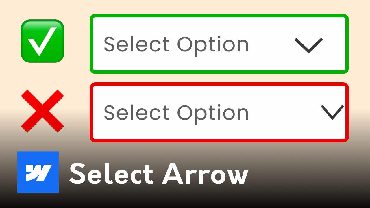
If you’ve ever used the native Webflow Select Component, you’ve probably noticed a common design flaw: the default arrow is often stuck too close to the edge of the field, and Webflow doesn't give you a native "style" panel to move it.
In this quick tutorial, I’ll show you how to remove that default arrow and replace it with a custom, perfectly positioned image using a tiny bit of CSS.
By default, the arrow in a Webflow dropdown field is a browser-rendered element. This means you can’t easily change its color, size, or padding. Often, it ends up touching the right edge of your div block, making your forms look unpolished.
To replace the arrow, we first need to get rid of the browser's default one. We do this by targeting a specific Webflow class: .w-select.
HTML
<style>
/* Targets the internal Webflow class for select fields */
.w-select {
appearance: none;
-webkit-appearance: none;
-moz-appearance: none;
}
</style>
This removes the "system" arrow across all your select fields while keeping the functionality intact.
Now that the default arrow is gone, we can add our own and position it exactly where we want it.
As I discuss in my Webflow Image Tutorial, using percentages for background positioning is a professional standard. It prevents the icon from "jumping" or overlapping text when the field shrinks on smaller screens.
If you found this quick fix helpful, you'll love my full-scale systems for building high-end client sites.
Derek Siu | Sydney Webflow Designer & Developer